Ideas on modernizing the open-source desktop
Mirrored from Hacker News — AI on Front Page for archival readability. Support the source by reading on the original site.
Welcome to LWN.net
The following subscription-only content has been made available to you by an LWN subscriber. Thousands of subscribers depend on LWN for the best news from the Linux and free software communities. If you enjoy this article, please consider subscribing to LWN. Thank you for visiting LWN.net!
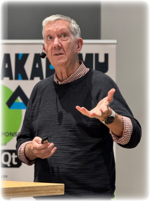
Scott Jenson has been working on user interfaces (UIs) and user experience (UX) for many years at Apple, Google, and other companies. Now, he's trying to convince open-source projects to experiment more and drive the desktop beyond the age-old "windows, icons, menus, pointer" (WIMP) model. At Akademy 2026, KDE's annual developer conference, he shared his complaints and ideas in a talk aimed at convincing those in attendance to take the lead on desktop design.
He introduced himself as someone who has been doing UX for a long time, much
of that time at Google. He said that over that time he had noticed a cultural shift,
"because back in 2005 when I joined, we weren't evil; we were really trying to do the
right thing
". He had worked on the Chrome team for a while, which he said was
"filled with people who wanted nothing but open-source, open-web
"
projects. Things had changed radically, which led him to leave Google, "but I'm
trying to atone for my sins working for these companies
".
He now does work for Mastodon and Home Assistant, "just kind of trying to
squeeze a little bit more good UX design into open source
". Jenson said he did
not want to be confrontational, but he thought that open source needs a lot of help
in the area of UX design. That is challenging, because open-source projects are
understaffed.
Innovation
He was at Akademy to discuss his ideas because he had given a talk
similar to this at Ubuntu's conference last year, which proved to be popular. "It
got more than half a million views on YouTube—which by YouTube standards is
trivial, but by Scott standards is enormous.
" That told him that the topic of
desktop UX was something that people wanted to talk about. This time around, he also
wanted to show a few examples of prototypes he had to demonstrate his ideas.
He thinks that desktop UX is very different from other kinds of UX. Jenson related
a story about working on the Macintosh's Finder application, which is a file
manager. The team "wanted to do ellipses
" in file names when showing a file in
the Finder that had a name too long to display in its entirety. The developers wanted
to put the ellipsis at the end of the file name, but he thought that would lose
too much information, and suggested that the ellipses should be in the middle of the
file names. "It's now considered to be one of those things that's an exciting
little attention-to-detail issue the Macintosh does.
"
Another UX detail that he worked on is the way that clicking and dragging files from one window to another works on the Mac. A mouse click action has two parts: when the user depresses the button (mouse down) and when the user releases the button (mouse up). On the Mac, item selection happens on mouse down, but the window only raises on the mouse up action. In other words, if a user drags an icon from a Finder window into another window, the first window is not raised.
On most Linux systems, though, if a user is trying to click and drag a file from a window in the background it will cause the window to raise as soon as the user does the "mouse down" action. That complicates trying to click and drag a file from one window to another. That is a fundamental action that means that users can't move data into applications quite as easily on Linux as they can on the Mac.
He said that he had talked about that issue two years ago on Mastodon, which raised a response from a KDE developer who thought it was a good idea to separate the mouse down and mouse up actions when dragging data between windows. Then they implemented it a few hours later.
"I forgot who that was. So if anybody here did that
", he said, but before
he could finish the sentence a voice from somewhere in the room responded, "you're
welcome
". Jenson yelled "thank you! I've been wanting to meet you for two
years!
" That was an example, he said, of how open source can be awesome:
someone can just say "that's a good idea, I'll just do it
" and then rapidly
implement and push the feature to the project.
Stabilized
The point he was really trying to make, though, is that the desktop UX
had not really changed in 20 years. There were plenty of new ideas and improvements in
the 1980s and 1990s, "and then it just stabilized, and not much has really
changed
". But people are doing much more with their computers today, and he
thinks that there are ways for desktop UX to grow.
Much of the UX for Linux systems was originally copied from Windows and the Mac,
"KDE even says it's for Windows users, that it wants to be similar to Windows for
users
". There's nothing wrong with that, but he felt that the Linux community
"in general
" had been leaning on Microsoft and Apple to do all of the UX research
and testing, "and frankly, [make] the mistakes
".
Some might point out that GNOME has conducted user research for some of its design changes, and KDE's human-interface guidelines (HIG) were also developed based on research by its contributors. However, it would be fair to say that these are exceptions rather than the norm; certainly, no one is funding or conducting regular UX design research and development for the Linux desktop overall.
He said that it is smart to let Apple and Microsoft do these things first "so
we can draft behind them
", but the problem is that "they've just kind of given
up to an extent
". Apple has been letting its desktop UX, and desktop hardware,
"languish for years and years and years
" because it had shifted its focus to
the iPhone and iPad devices. "I mean, like, Apple wanted the Mac to die. They
wanted the world to move over to the iPad. Guess what? It
didn't.
"
Apple has since turned its attention back to the Mac, but the things they've done
since—such as the Liquid
Glass design language—have not been really popular with users. The features
that Apple tends to add, he said, are "basically about tying it closer to the
iPhone, tying you closer into their ecosystem
". That isn't about improving the
desktop, it's about increasing their moat.
Microsoft "is just making one mistake after another
". He cited the
company's attempts to force users to store files using its OneDrive cloud-storage service, the
privacy-invasive Windows
Recall feature that drew widespread criticism, and "ads everywhere
" on the
Windows desktop. His point was not to bash Apple or Microsoft, though the audience
didn't seem to object to this, it was to point out that the Linux desktop could not
follow their example any longer. "The whole Linux community has been just waiting
for Apple and Microsoft, more or less, to take all the risks, and they're not taking
any more risks.
"
Three pushbacks
Jenson emphasized that he didn't want to change everything, but he wanted to see
experiments and additional development aimed at improving the desktop
experience. However, he said that he gets pushback when he tells people that desktop
innovation has stopped, and that the Linux desktop "can't just patch and bug fix
our way into the future, we have to start taking leadership ourselves
".
He grouped the pushback into three categories. The first objection he receives is
"mobile won; the desktop is old, just do what mobile does
". He dismissed that
by saying that mobile has indeed won the consumer market, social media, and other
areas, but "it didn't win productivity
". People still do their work on
computers, because "desktops are silently awesome; they have keyboards and big
screens, and they can do amazing things
". However, people have lost sight of that
and don't really appreciate how good desktops are. "I think we should understand
why they're good, and then what we can do to make them better.
"
The second objection he hears is that there are only so many ways that the WIMP
model can work. "Just stop trying to fix it; it's done.
" He disagreed with
that as well, and thought that there was more to be done. The final, particularly
strong, objection from the tech community is "don't touch my stuff
". People
get angry when they have worked hard to get their desktop environment just as they
like it and something changes to disrupt that. "And I get that. As I said before,
I don't want to change everything.
" But the world is changing, "and we need to
grow our way gently into some new things.
"
What is UX?
Thinking about where to go next with desktop design gets to the question "what is
UX?" He said that term was misunderstood and that people, especially manager types,
"they think it's just pixels, but UX is so much more than pixels
". It helps to
think of UX as having layers, he said. There is style, which consists of white
space, iconography, color schemes, and yes, pixels. But there is also structure, he
said, which is how the user moves through the application, the navigation
model.
Strategy is another part of UX; understanding who the target user is, and
determining what they want. Deciding what is important, and what is not; what will
the development team prioritize and what will it ignore? "The fastest way a UX
designer can save your team time is to help you say no.
"
There is also a layer he called "stuff
": the lower-level limitations of the
underlying technology that a platform has which influence UX. For example, he said, if
an application is being created for DOS, "you're not going to write a nice
Macintosh application. The technology dictates what you can do
". The desktop has
been evolving for 40 years and has "historical cruft
" that carries expected
standards.
We just have a bunch of stuff that we just accepted. And I think if we're going to fix the desktop, we have to understand this lower-level limitation, and how do we want to fix that? We just accept that mobile and desktop has stuff today, and we just don't think about fixing it.
People forget, he said, that the original Macintosh screen was "a whopping 342
pixels high
". Naturally, windows overlapped a lot. Since then, "we just
assumed that Windows have to overlap
". But many people have "giant, giant
screens
", and the existing window-manager model does not work so well for those
devices. "I can understand why people use tiled window systems and so forth,
because this existing model just does not work very well.
"
Understanding the future
Early in the talk, he had referenced a saying by Alan Kay, who had led design of the
first WIMP interface at Xerox PARC: "Perspective is worth 80 IQ points.
"
Jenson now circled back to Kay: "Who, as you can tell, I really like a lot. [...] He
talks about three steps to understand stuff
". The first step, he said, was to
think about the present, "what is happening right now?
" The second is
"don't forget the past, know what work has happened before
", and the final
step is to ensure that "your questions are really clear
". Too many people rush to
a solution, he said, but they should be rushing to questions. If the questions are
clear, then the answers will be better.
He did not want to make the talk about AI, he said, but he had to address
it. "I have to talk about AI, and it pisses me off because there's so many cool
things we could be talking about, and AI just sucks up all the oxygen, and it's all
you can talk about
". But, he conceded, there are many things happening with AI on
the desktop, albeit in a weird way.
He explained some of the current efforts to integrate AI with the desktop as
"trying to sneak AI in
" while keeping the UI exactly the same. Other efforts
try to use AI to understand what is on the screen and use chatbots to interact with
the interface, "which I think is kind of missing the point here
". That is,
until last summer when Anthropic introduced Claude Code. "It completely changed
things, because was looking down into your filesystem
" and drew context from the
content of a user's files. That allowed it to do more interesting things and interact
with the system.
After mentioning Claude, he paused to say he was only speaking about frontier
models because everyone else is discussing them. "I have a lot of personal
problems with the frontier models. They are ethical and environmental disasters. I am
not very excited by them
". He said he was excited by Apertus, which is billed as a fully open,
responsible model for sovereign AI created by the Swiss AI Initiative. "I do think it's
possible to talk about ethically trained small language models running locally, and
you don't have to sell your soul to the devil.
"
The curse of direct manipulation
The key point he wanted to make was not about generative AI uses, but about how giving it access to the filesystem improved its usability. It now had context and could work with the user's data, but it was working at the filesystem level and not using the desktop UX.
He talked about the desktop building blocks, basically the familiar WIMP model
plus the desktop clipboard, as the way that users move data around. Expert users
can move data around quickly, he said, but there's a problem: the desktop is
stateless. He called this the curse of direct manipulation; there is no working
memory to the desktop. "If you copy a few too many things to the clipboard, oh
sorry, it's gone
".
Jenson theorized that the reason there are so many desktop environments, window
managers, and Wayland compositors for Linux—as well as alternative clipboard
managers—is because the desktop isn't quite working right for users. He thought
it was really about working memory: "How do I manage my data in such a way that I
can remember it across all of these things and actually use it.
" His perspective
shifted to asking "what would we do to working memory to improve the desktop
UX?
"
AI may have given him the idea, but he added that he wanted to solve the desktop
UX for people first. "If the AI can use it, great. I don't care. That comes
later.
"
Remember your past
There is prior art in trying to create systems that help provide users with more
context and working memory related to their data. He referenced a paper called
"Lifestreams: a storage model for personal data". That paper made the case that
desktop systems are "are ill-equipped to manage the electronic information and
events of the typical computer user
", and introduced the Lifestreams idea as a
metaphor for dynamically organizing a user's computer workspace.
That paper influenced the ill-fated WinFS project from Microsoft, which was an attempt to merge data storage and management based on relational database systems. It was demonstrated in 2003 and scheduled to ship sometime later, but ultimately the project was shelved in 2006. On the free-software side of the house, there was the semantic desktop project NEPOMUK, which was a research project funded by the European Union.
A version of NEPOMUK was included
in KDE 4, with the idea was that it would allow applications "to use
information from all over the desktop, the web, other devices, and combine it into
one coherent interface
". It was later removed and replaced with the Baloo file-indexing and search framework
for the Plasma desktop, which has some overlap with NEPOMUK's functionality but with
a reduced scope of features.
Jenson said that he is concerned that people see the failure of those projects as
proof that the ideas were wrong. He argued that is not the case, "I would say that
it is the hardware and systems at the time let the vision down. I think it's time to
rethink these projects
" in light of newer hardware and better systems.
Prototypes
Having visited the present and the past, as Kay recommended, he had come up
with a few questions that he thought worth exploring related to desktop UX. The first
was "what would happen if we only designed for large monitors?
" What would it
unlock if there were desktop designs that ignored laptops and only focused on
widescreen monitors? Another question he had was how could the desktop capture a
user's intent over time?
Those questions led to the prototypes that he said he was a little nervous to show
the audience "because technical people love to find mistakes
". The demos are
about 29 minutes into the video
of Jenson's talk. His slides have not yet been published but he told me at the
event that they would be at some point.
The first demo was to show how a desktop might make better use of a widescreen
display. He noted that the center of a widescreen monitor is good for working
with an application, but it becomes more difficult to work on the sides of the
monitor. "It's good for peripheral vision, but not good for working
".
He demonstrated a desktop layout, a screenshot of which is below, that would put the
focus on the window or windows in the middle of the monitor. He had included a grid
in the background that tapers off from the middle of the screen to simulate a
widescreen monitor. The idea was that a widescreen-first desktop would emphasize
information in the middle of the screen, and then use an Exposé-like tiling model to arrange the
rest of the desktop's windows. This would make the windows that were not in use
easier to interact with, he thought, and be a better model than virtual desktops for
managing lots of windows. "I'm not against virtual desktops. Virtual desktops are
used by very organized and intelligent people. I know my audience.
" However, he
said, most people can't deal with virtual desktops.
![[Window manager widescreen demo]](https://static.lwn.net/images/2026/wm-demo-sm.png)
He also demonstrated dragging a music-player window all the way to one side of the
screen, which he called "the stash area
". As it moved to the edge, it
transformed into a widget with just a play button instead of showing the full
window. He thought that it would be possible to do the things he was demonstrating
with Wayland as it is today.
Jenson put up another demonstration of an improved clipboard model that copied
ideas from the Obsidian editor's Canvas feature. Canvas allows users to drag and
drop images, text, and files to create a visual layout of information. A user could
create a document and drag information from a web browser into the document, drop a
file in from another source, "the idea here is that this is now effectively a
collection of stuff that I have gathered for this document. And if I close it and
then come back tomorrow, it's all still there
". He added that a local AI would be
able to come in and organize the information a user had gathered, "oh, look,
you've got a bunch of hotels, let me organize them for you
".
The final idea he discussed was a way of gathering "privacy-preserving
data
" to help give users a better visualization of things like web-browsing
history. A web browser will only give the user a view of their browsing history that
"is not very useful
" he said, so he tried to gather data "not using AI,
just using simple math
" that would use attention signals—such as how long
the user was on a web page—to tell a story of where they spent their time on
the desktop. "I basically came up with this spatial associative episodic memory
prompt
" to organize data in a helpful, interesting way. He thought that working
memory was a good way to explore new ideas for desktop UX.
So the goal with this talk is to say, let's start to take this apart. And I really hope that my prototypes cause you guys to come to me and say, We forgot about this, and let's talk about that. [...] So I just want us to try, because no one else is going to try, and I think someone's got to start.
There was time for a single question. An audience member asked how Jenson's model
would protect against all of the privacy concerns that Microsoft faced with Windows
Recall. "How are we going to make sure that this history remains only accessible
by the user and cannot be hacked in like it could happen with Windows
Recall?
"
Jenson answered that his idea was to gather telemetry data, "not interesting
information
", which would significantly reduce the attractiveness of the data to
would-be attackers. He said he did not want to underplay the issue, though, and
wanted to build prototypes to see if the idea was good first, and then explore ways
to encrypt or protect the data. He agreed that even this data could be valuable
information. He added that the biggest problem with Windows Recall was "how
stupidly they protected it
" and he was sure others could do a lot better job.
[I would like to thank the Linux Foundation, LWN's travel sponsor, for its assistance with my trip to Graz, Austria for Akademy 2026.]
| Index entries for this article | |
|---|---|
| Conference | Akademy/2026 |
I'm in the "it's done" camp
Posted Sep 23, 2026 17:30 UTC (Wed) by jzb (editor, #7867) [Link]
"I'm very productive and do not want a radical desktop change"
Yes, he addressed that objection during the talk. I agree, but there have been some advances (e.g., tiling WMs) that for some of us allow to keep our productive habits and add some new tricks. His point that, for example, a lot of widescreen space is wasted was accurate, IMO. I'd love to see KDE or niri or another desktop experiment with his idea to make better use of widescreen monitors. The other demos, I was less excited by, but all of those things could also be optional rather than mandatory additions to a DE like KDE.
I'm in the "it's done" camp
Posted Sep 23, 2026 17:41 UTC (Wed) by mb (subscriber, #50428) [Link] (3 responses)
I'm back to XFCE. But not because I think XFCE is better per se. Just because so many applications break with tiling window managers. It's a constant struggle with some applications.
XFCE has the advantage of being the common MVP that basically everybody agrees on is usable. And it has the advantage that it doesn't change very much over the years.
But there certainly are better ways to do things in principle.
And I think tiling (in some way or another) is one of these things.
I'm in the "it's done" camp
Posted Sep 23, 2026 17:42 UTC (Wed) by dskoll (subscriber, #1630) [Link] (2 responses)
Huh. I briefly tried a tiling WM and I hated it. I guess I'm too used to the way I've always done things to want to change now. 🙂
I'm lucky enough to have the luxury of four monitors, so my three most-used apps each sit on their own monitors, which reduces the need for a tiling WM.
I'm in the "it's done" camp
Posted Sep 23, 2026 17:47 UTC (Wed) by jzb (editor, #7867) [Link] (1 responses)
I don't care for the traditional tiling model, but the "scrolling tiling" model as implemented by PaperWM (GNOME extension) and niri is amazing for me. Other people's mileage may vary, of course.
I'm in the "it's done" camp
Posted Sep 24, 2026 10:32 UTC (Thu) by winden (subscriber, #60389) [Link]
I'm in the "it's done" camp
Posted Sep 23, 2026 17:58 UTC (Wed) by opsec (subscriber, #119360) [Link]
Yet, I think that working on user interfaces isn't a bad idea, so I hope he'll have successful prototypes for us to learn from.
I'm in the "it's done" camp
Posted Sep 23, 2026 20:02 UTC (Wed) by dankamongmen (subscriber, #35141) [Link]
I'm in the "it's done" camp
Posted Sep 23, 2026 20:54 UTC (Wed) by [email protected] (subscriber, #75441) [Link]
I'm in the "it's done" camp
Posted Sep 24, 2026 6:59 UTC (Thu) by rrolls (subscriber, #151126) [Link] (1 responses)
Perhaps the reason people keep thinking they need to fix things is because they only have exposure to mainstream desktops, all of which have been messed up by now? :)
I'm in the "it's done" camp
Posted Sep 24, 2026 15:11 UTC (Thu) by fredex (subscriber, #11727) [Link]
When the Gnome folks brought out the abomination that is/was Gnome 3 I found it impossible, and wondered why anyone would think such a travesty was actually good.
As soon as I found Mate I converted and am very happy with it, and have little reason to try any other desktops.
KDE wants to repeat the 4.0 disaster?
Posted Sep 23, 2026 17:06 UTC (Wed) by Cyberax (✭ supporter ✭, #52523) [Link] (1 responses)
I remember that time. The "semantic desktop" craze, that resulted in KDE becoming unusable for several years. All to allow... something? I was never quite clear about what the end result was supposed to be.
KDE wants to repeat the 4.0 disaster?
Posted Sep 24, 2026 13:55 UTC (Thu) by gspr (subscriber, #91542) [Link]
Animations
Posted Sep 23, 2026 17:10 UTC (Wed) by jpeisach (subscriber, #181966) [Link] (20 responses)
I may not see it because of my environments, but compared to.. well, Apple, obviously, but I think other UXs in general: there isn't a lot of emphasis on animations. Sure, we have it but I don't think we have as much "animations" and "transitions", or "fade outs" in everywhere it could be.
Of course, the more you put in of any project, the more you get out. Larger projects are much better at this, like KDE.
Animations
Posted Sep 23, 2026 17:33 UTC (Wed) by carlosrodfern (subscriber, #166486) [Link] (14 responses)
Animations
Posted Sep 23, 2026 18:19 UTC (Wed) by demiguru (subscriber, #176724) [Link] (3 responses)
I remember those days as well. I miss the fact that we were allowed to have a playful environment. It should still be an option. Granted, it is not for everyone; however, being productive and being playful should not be mutually exclusive.
Animations
Posted Sep 23, 2026 18:33 UTC (Wed) by dskoll (subscriber, #1630) [Link] (2 responses)
One of the more fun desktops I played around with in the old days was Eagle Mode, an infinitely zoomable desktop.
AFAIK, it still compiles and runs; I have it installed and sometimes run it in a window just for fun.
Animations
Posted Sep 23, 2026 22:32 UTC (Wed) by jpeisach (subscriber, #181966) [Link] (1 responses)
Animations
Posted Sep 24, 2026 0:12 UTC (Thu) by willy (subscriber, #9762) [Link]
Animations
Posted Sep 23, 2026 19:26 UTC (Wed) by hallyn (subscriber, #22558) [Link] (2 responses)
Animations
Posted Sep 24, 2026 7:22 UTC (Thu) by taladar (subscriber, #68407) [Link] (1 responses)
Animations
Posted Sep 24, 2026 12:43 UTC (Thu) by hallyn (subscriber, #22558) [Link]
Animations
Posted Sep 23, 2026 19:46 UTC (Wed) by rgmoore (✭ supporter ✭, #75) [Link] (6 responses)
Animations can be more than just eye candy. Properly done, they can visually convey some information that isn't always obvious otherwise. For example, having a popup window emerge from the window it's popping up from lets the user know what's going on without having to say it explicitly. You can do it quickly so it isn't wasting the user's time, but seeing it happen makes everything obvious. That kind of thing can make software more usable without necessarily being flashy and distracting.
Animations
Posted Sep 23, 2026 20:16 UTC (Wed) by Cyberax (✭ supporter ✭, #52523) [Link]
A proper solution can encode the parent-child relation by using color coding (or a hatching pattern) of title bars, for example. Or by shading the window of the popup's parent.
Animations
Posted Sep 23, 2026 20:24 UTC (Wed) by mathstuf (subscriber, #69389) [Link] (2 responses)
I turn off animations where I can (Android, the macOS machines I have to use, etc.). My concern is around things happening which are not in relation to a user action. The animation just gets more distracting and the "bounciness" it tends to come with is, IMO, just obnoxious. Especially on macOS where window focus is as fickle as a fallen leaf in October. Better to just get the "punch in the face" over with than having to track where the heck it's going to land so I can dismiss it.
That said, I do appreciate that the option exists; I just wish it was under accessibility and not behind Android's "developer mode".
Animations
Posted Sep 23, 2026 20:28 UTC (Wed) by Cyberax (✭ supporter ✭, #52523) [Link] (1 responses)
But it is! See: "Accessibility" -> "Color & Motion" -> "Remove Animations"
Animations
Posted Sep 24, 2026 0:11 UTC (Thu) by mathstuf (subscriber, #69389) [Link]
Oh, that's nice! Still going to enable developer mode though :) .
Animations
Posted Sep 23, 2026 20:32 UTC (Wed) by mb (subscriber, #50428) [Link] (1 responses)
These things add up quickly to large amounts of wasted time, if they are non-zero.
Encoding desktop information in the time domain is an extremely bad idea. There are millions of pixels available for displaying information. Why encode anything in time?
>having a popup window emerge from the window
Popup windows shall only pop up after explicit user actions. Automatic popups are a really bad idea. (I work with applications that auto-popup modal dialogs in the freaking background).
If there is a popup after a user action, then there is no need for animation to show where it came from. The user knows already.
Animations
Posted Sep 24, 2026 9:42 UTC (Thu) by josh (subscriber, #17465) [Link]
There are well-studied reasons for it. One notable one: human visual processing is incredibly well adapted to spot moving things.
Animations
Posted Sep 23, 2026 18:25 UTC (Wed) by Cyberax (✭ supporter ✭, #52523) [Link] (3 responses)
This is _the_ goal for mobile interfaces. I'm not joking, Google evaluated such metrics as "rebeliousness", "being in the know", and "brand recognition" when designing Material 3 guidelines ( https://design.google/library/expressive-material-design-... ).
> On top of that, there was a 30% jump in rebelliousness, suggesting that expressive design positions a brand as bold, innovative, and willing to break from convention.
Android supports disabling all the animations. I remember the research that said that this alone reduced media consumption by about 20% for Instagram (I think). I can't find it now, though.
Animations
Posted Sep 23, 2026 18:30 UTC (Wed) by mb (subscriber, #50428) [Link]
This is among the first switches I flip after starting with a fresh Android.
Animations
Posted Sep 23, 2026 19:06 UTC (Wed) by pizza (subscriber, #46) [Link] (1 responses)
Animations also convey "something is happening/has happened" visual feedback.
> I remember the research that said that this alone reduced media consumption by about 20% for Instagram (I think).
Like most technologies, it's important to remember that animations can be used for both good and evil. Intent/purpose matters.
Animations
Posted Sep 23, 2026 19:39 UTC (Wed) by Cyberax (✭ supporter ✭, #52523) [Link]
There are _very_ few animations that are helpful. The general rule is that everything outside your foveal area is distracting. So "small" animations such as a blinking cursor or a button press animation are fine.
Progress spinners are on the "maybe" list. They're helpful when you have a truly blocking operation that prevents the user from progressing further in the flow. But only if they are not fake and/or excessively distracting.
For example, animated skeletons are often bad because their explicit goal is to keep the user's attention on the app even though the content might not actually be available. They become a cheap workaround, so instead of making your app faster, you just add a skeleton page (in other words: "down with the necromancy!").
Other types of layout transition animations (e.g. an animated collapsing sidebar) are usually harmful for experienced users but can be helpful for new users. It's great to have them as a teaching tool, but with a way to disable them when they become distracting.
Actually... It might be an interesting experiment: gradually increase the animation speed each time you use a feature until it becomes isntant.
Animations
Posted Sep 24, 2026 7:39 UTC (Thu) by andreashappe (subscriber, #4810) [Link]
There is Burn my Windows for GNOME.
I use it with the star trek like beamer effect for new/destroyed windows (with highly increased animation speed though).
I first thought it gimmicky, but to be honest once you're used to it, those 250ms animation that makes it very clear on my large desktop screen that a window appeared/disappeared is actually very helpful.
Changes must justify themselves
Posted Sep 23, 2026 19:42 UTC (Wed) by david.a.wheeler (subscriber, #72896) [Link] (1 responses)
Every UI change means I must learn the new way of doing things, which takes time. Most people use computers to get things done, not to learn a new quirky UI. So the change needs to be easy to learn and *justify* the strain on users who must unlearn the old way and learn the new way.
Where that's justified, wonderful! Let's have that change. But let's not have change for change's sake. No thank you, I have other things I'd like to do with my life that are more important to me.
In this specific case, a UI that is only good on really large screens is a pain. We already have mobile vs. desktop, but that's not hard to justify. Splitting the second case, to require me to learn yet ANOTHER UI, looks quite unjustified.
Changes must justify themselves
Posted Sep 23, 2026 21:25 UTC (Wed) by rgmoore (✭ supporter ✭, #75) [Link]
In this specific case, a UI that is only good on really large screens is a pain. We already have mobile vs. desktop, but that's not hard to justify. Splitting the second case, to require me to learn yet ANOTHER UI, looks quite unjustified.
That depends on how it's done. It's fine to have a UI that is only good on really large screens as long as it's strictly optional. If you want to use the same UI regardless of your monitor size, that should be your call. My impression from the article is that what they're talking about in this case isn't really a completely different UI, anyway. It's more about different approaches to having more windows than will fit in your available monitor space. We already have more than one solution to that problem (e.g. switchable virtual desktops vs a moving viewport) so it isn't crazy to think about adding a few more that are optimized for specific monitor setups.
Command line has UX too
Posted Sep 23, 2026 19:46 UTC (Wed) by kleptog (subscriber, #1183) [Link]
He couldn't grasp the idea that a command line tool could also have a interface that could be optimized. I never really shook the feeling he was a UI designer claiming to be UX designer because it sounded better. ISTM the higher level concepts of UX design would also work for command line tools, but it's a different world with different rules.
That said, this talk sounds interesting. I'd really like to also see attention to how to make the shell interface more useful. Every now and then a new shell pops up with new ideas but they never really take over.
Crawling before sprinting
Posted Sep 23, 2026 20:23 UTC (Wed) by quotemstr (subscriber, #45331) [Link] (1 responses)
Can we fix this, despite it being a clear problem that's persisted over decades? No? Then why do we think we'll be able to do the much more subtle attention to detail thing the article discusses?
Crawling before sprinting
Posted Sep 23, 2026 22:33 UTC (Wed) by jpeisach (subscriber, #181966) [Link]
I'm torn on this
Posted Sep 24, 2026 8:04 UTC (Thu) by chris_se (subscriber, #99706) [Link] (1 responses)
I my opinion the main thing I'd like to see changed on the Linux desktop is better integration between applications and the various desktop environments. Unless the application comes with the desktop itself, it's highly likely that there are going to be "rough edges" where various paradigms clash with each other. The most basic example is that there are no consistent open/save dialogs across applications. Of all of the applications I have currently running I can immediately produce 4 different file selection dialogs. And that's just the most basic example, I can think of 10-20 more of the top of my head. If I start a GTK application on KDE I want to see a menu bar (and not the menu icon in the top-right of the window), while if I vice-versa start something else on GNOME I'd want it to not have a menu bar in the window itself, and follow GNOME's design. I want the theming to match out of the box (I know there is some support for this with extra software you can install, but again, there are a lot of rough edges, and most importantly, it's not the default). I want consistent file associations across all applications (while all applications support the XDG standards, all major DEs have additional things that override those, which then are only supported by applications native to those DEs).
On of the things that made Windows and macOS so successful in decades past is that there was a significant level of consistency across the desktop and most applications. That has all decreased dramatically in the last few years (more so on Windows, less so on macOS), so there's not really that much of a difference anymore between Windows, macOS and Linux when it comes to consistency - but not because Linux DEs got that much better, but because Windows and macOS became that much worse. (Especially on Windows, where Microsoft has like 10 different UI toolkits that all look different they still support.)
I'm torn on this
Posted Sep 24, 2026 15:07 UTC (Thu) by quotemstr (subscriber, #45331) [Link]
More from Hacker News — AI on Front Page
Discussion (0)
Sign in to join the discussion. Free account, 30 seconds — email code or GitHub.
Sign in →No comments yet. Sign in and be the first to say something.