The Most Important Charts In The World
Mirrored from Don't Worry About the Vase for archival readability. Support the source by reading on the original site.
We all need a break so: What is the most important chart in the world?
I decided to ask Twitter, and got a lot of good answers.
So today, with few of my picks, I present: The Most Important Charts In The World.
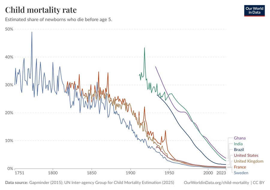
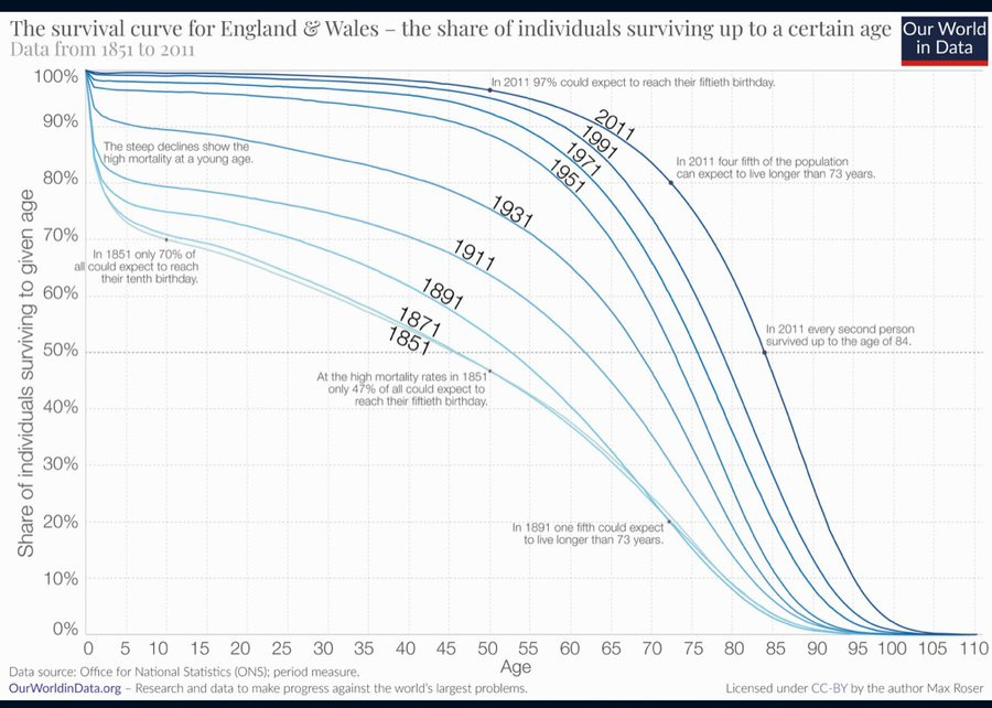
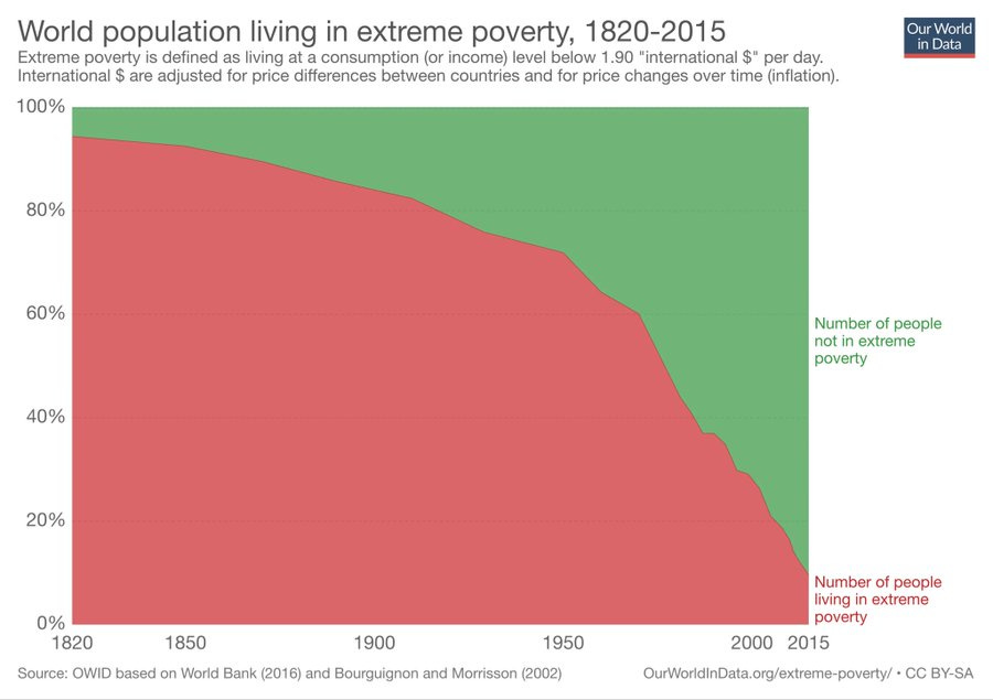
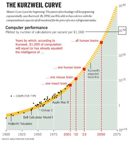
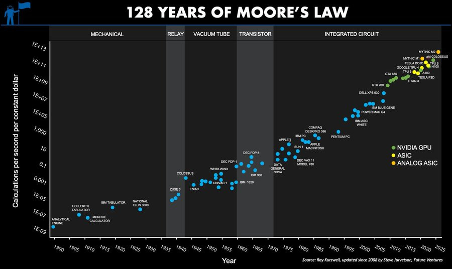
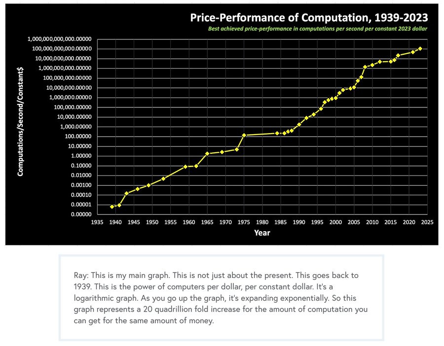
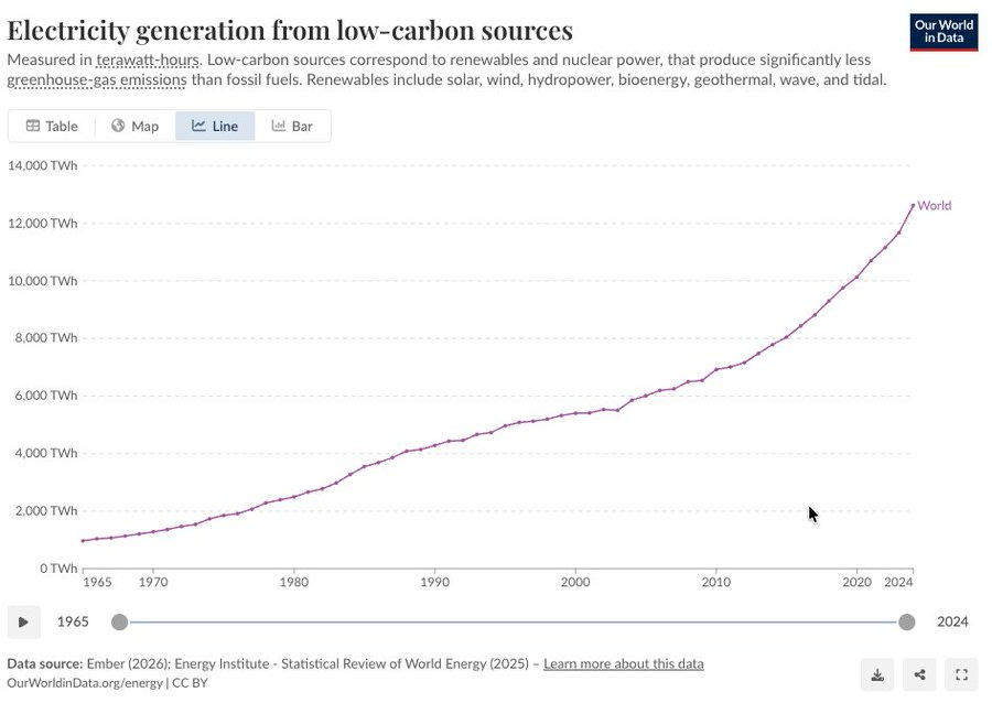
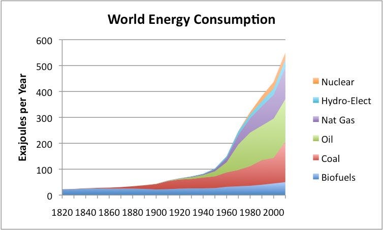
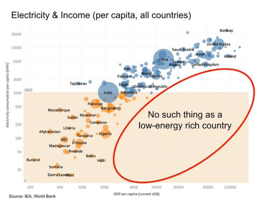
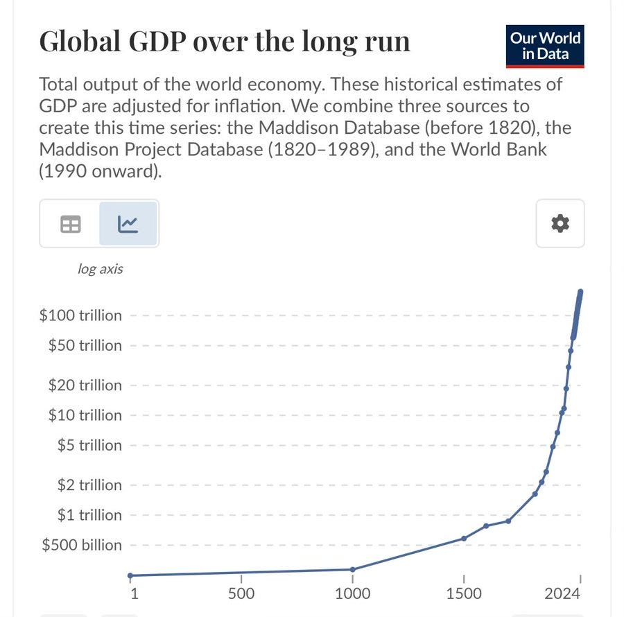
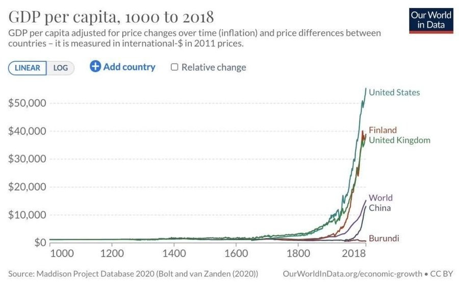
You’ve got to admit it’s getting better. Better all the time. Mostly.
The Original Most Important Chart
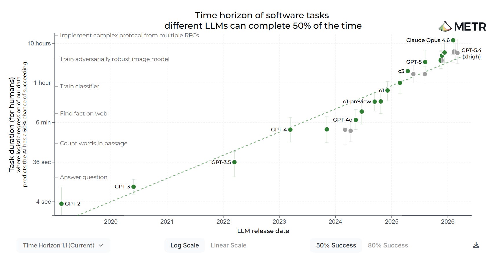
The context for this is the METR graph, which is often given that label, where the x-axis is release date and the y-axis is the log-scale time horizon for AI models doing software tasks with a 50% or 80% success rate, usually people use the 50% graph:
If AI models continue to be able to do increasingly long tasks fully autonomously, and trends continue, this suggests we are not too far from a point where AI can do its own AI R&D, with the result of ‘rapid capability advancement,’ also known are Recursive Self-Improvement (RSI) or ‘escape velocity,’ after which… well, no one really knows, but the world presumably transforms into something even more bizarre and inexplicable, which may or may not contain humans or have any value.
This has been your scientific briefing.
Show Me The Money
There are always the basics.
Bad Things Happen Less
Patrick McKenzie: There are many which show this same fundamental story but this one is particularly emotionally moving to me.
It doesn’t stop with childhood.
Along with death, poverty. You can quibble with details, but it doesn’t matter.
Remember that every time someone focuses on relative wealth:
Although some comparisons are useful:
Importantly also this (unclear weapons detonated outside tests, by year):
The Exponential
The METR graph is one variant of a common theme.
Energy, including low-carbon energy, alas this graph is only linear:
Global GDP works the same way, yes this is a log scale on the y-axis, remember you live in a very normal situation that is likely to continue.
You can also consider this angle, of course:
Michael Lucy: is this a trick question
Find Out
Arthur Spirling: surely a contender
(The above is about the spread of cholera.)
In its own way, also this, although you can’t read it here.
Fertility Crisis
If the exponential growth curves don’t bail us out, these get rather important.
However You Look At It
The rise of meat consumption, which is mainly chickens.
Important Things To Know
Such as not starting a land war in Asia.
Or the eight virtues of the avatar, some of us remember:
No, wait, there are twelve virtues, we’re rationalists.
So many things to know.
Andy Ryan: The most important chart in the world is obviously this
Taste the lopsided rainbow. The Skittles are independently distributed?
David Curran: Skittles are lying to us.
Todd Jones: Japan's Phillips Curve Looks Like Japan
Other people need practical advice:
Never forget that it could also be this one underneath it all:
Or, of course, this one:


Discussion (0)
Sign in to join the discussion. Free account, 30 seconds — email code or GitHub.
Sign in →No comments yet. Sign in and be the first to say something.